
It happens. A busy couple builds their happily-ever-after house on the beach, hires a pro to dress it up, and then … well, time passes and they get plain old tired of this or that décor element that went from nice-enough to no-thanks now.
So it went with Debbie and Dave Roberts. The Roberts, whose career keeps them on the road, were worn out coming home to interiors that needed some jazzing up. While their house always erred more toward “swellegant” than shabby (Dawson’s Creek shot its last episode there), they craved a fresh look. Enter their daughter, Angel Roberts, of Roberts
Erickson Designs.
Angel, who lives in nearby Charleston with her husband and two kids, had long vacationed at the family home on the Grand Strand and was more than ready for the re-do. But don’t think nepotism for a minute. A former fashion stylist for That ’70s Show, Angel’s own pop-flavored homes have appeared in Cottage Living, Charleston Home, Better Homes & Gardens, and the British magazine, 4Homes.
Built ten years ago, the three-story, 6,500-square-foot stucco affair looks out over the Atlantic from the Golden Mile. From its North Ocean Boulevard vantage, its classic fountain and sweeping brick entry stair rank as rather impressive in an impressive stretch of homes. From the beach, though, it’s near glorious, as its backside is comprised of towering windows that peer out over a pool, a hot tub, a volleyball court, and then the water. Here’s how Angel made their house sing, and how you can follow suit.
“My parents live here full time,” says Angel, “but they like to feel like they are on vacation in their house.” To tap into that vibe, she set a few goals. The first: Make the ocean the centerpiece of the house. In order to get there, the view needed to be cleared, i.e. faux floral arrangements and more removed from in front of the windows. Unobstructed views are something she recommends for all seasidehomes. “You live on the ocean so you can stare at it,” she says, “so why look into fake flower arrangements when you’re trying to see out your windows? Forget placing things just for the sake of decorating. Instead, let the water be the showpiece, enhance it, and let it blow you away.” Next, since her parents’ place is a large, year-round home, Angel scrapped thoughts of a cutesy waterside theme. “I wanted to keep that beach feeling without going totally cheeseball beachy to the max,” she says. Thus she worked with waterside colors.
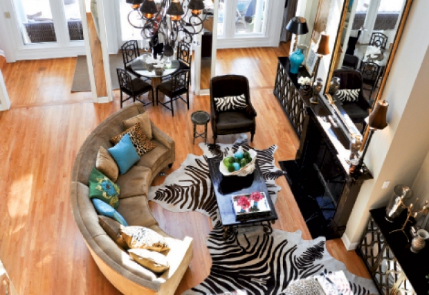
When it comes to color in waterfront homes, keep the view in mind, says Angel, to create a cohesive, organic look that coexists with the landscape rather than clashes with it. Pull from the sand, sea oats, sky, and water, she says, whether that’s a splashy or subdued interpretation. As for her parents, “They were very adamant about keeping neutral,” says Angel, “especially my dad.” Dave, who was recruited by Baker Furniture Company out of college and worked there until moving to Myrtle Beach, spent decades teaming with designers to create pieces that could be created in the plant he managed. “If you are familiar with Baker,” says Angel, “everything is so classic, so neutral, and that’s where his design sense comes from. It’s safe to say he’s a little afraid of color.” But take a look at the redesigned home and you can see that Angel talked her dad into some colorful zingers here and there. It worked because Angel kept existing neutral colors (like the tan walls in the great room) and then spread an array of neutral chocolates, khakis, and whites as a complementary, similarly neutral backdrop throughout the house. With that more or less in place, she sold her dad on a turquoise glazed pot with veins of green running through it, and next added beach-tinged pairs of colors here and there in every public room, in the guest suite, and on the porches. The result was a cohesive palette that tied a substantial home, one with large, expansive shared spaces and outdoor living rooms, together.
One of Angel’s signature traits is that she’s as down-to-earth practical as they come. Thus, unless something is dysfunctional or grossly “off,” she’s not likely to remove it just to make her stamp on a place. That played out in her parents’ home in a few ways. For starters, they kept the kitchen as-is. “It’s a totally OK kitchen,” she says, “and so I certainly don’t want to rip it out—that could easily have cost $100,000. Is it my first choice of kitchen? No, but accessorize a little and it works fine.” Further, the chandeliers stayed (at her mom’s behest); certain Baker Furniture pieces near and dear to her dad (the dining suite in particular); some wall colors; and other miscellany (the porch furniture and kids’ room linens). The point is that a refresh doesn’t necessitate starting entirely over. Keep those things that are functional, sentimental, and practical, and lose the ones that are not.
“When all is said and done,” says Angel, “my parents are pretty traditional in their style, and in their house’s public spaces—they like to keep things fairly safe. They’ve relaxed a little because of their grandkids, but nonetheless, they like soft lines, pretty things. I tried to sell them on a few modern, clean, hard-lined pieces, but, for the most part, they vetoed those.” Still, a little depth was called for to offset the uber-classic structure of the home and some of the aforementioned case goods. Thus Angel added parental-approved pieces with texture (hide rugs, faux-fur throws and pillows, velvet upholstery and cushions, grasscloth walls, seagrass rugs), a variety of finishes (sleek wood and reflective glass and mirrors), and patterns (embroidered pillows, zebra prints, and artwork and accessories). Lesson learned? Determine your style and stick to it. Then break up the boring with a little depth.
“My parents wanted to be close to the beach but they don’t like to go to the beach,” says Angel. “Sometimes they walk the beach at night, but they are not ones to be all in the sand and sun. They are more the type—like lots of people in Myrtle Beach—who like to enjoy it all from their kitchen table.” Given that, the luxe look of their home and its finer materials and finishes makes perfect sense. But, as any Grand Strand homeowner knows, outside is a different story. The Robertses have found that metal and natural wicker eventually disintegrate and plastic bleaches and cracks. Thus Angel kept a vinyl wicker set and outfitted it with new, chocolate fabric–covered cushions, and fashioned slipcovers for plastic Walmart stackable chairs. Ideally, she’d rather all were of weather-resistant fabrics, but because she couldn’t find the patterns she craved in that kind of material, she compromised. The takeaways here: Use what makes sense with how you live and with the environment, too.
When the house tour rolled around, sure enough, the Roberts home was ready, even if Angel was still adding finishing touches—fresh flowers, some pillows outside, and so on—up until the doors opened. And while the throngs of folks who poured in raved, the main judges, her parents, gave the final effort a thumbs up. “They are totally happy with it,” says Angel. “And my dad even loved the funkier stuff. It’s like they have a brand-new house now with none of those lingering, unfinished and outdated things that were bothering them before. Now it’s done. And now they can relax and enjoy it.”